
LOGO DESIGN
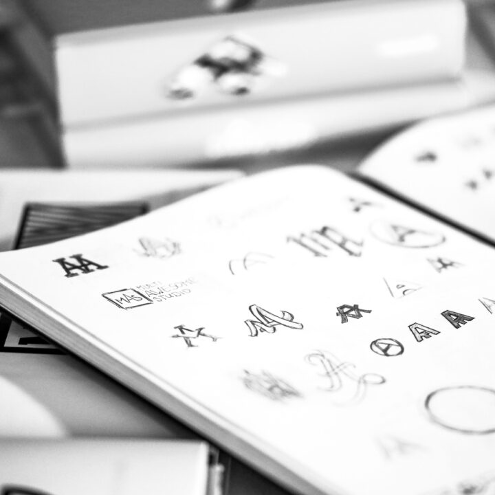
The design of a logo should be simple and memorable. That’s why we created a logo design which is versatile and easily to use while being legible in a variety of sizes. The logotype is accompanied with a simple pictorial mark. In our opinion a good logo is simple enough that basically a 5 year old could redraw it.


COLOR PALETTE
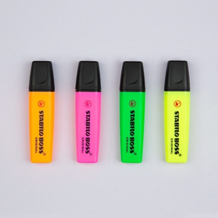
The colors system is based on the colors already existing in the studio. Base colors, like the off white, the not quite black and the almost neutral gray, were taken right from the studios environment itself. While the vibrant neon colors are inspired by our favorite time periods the 80s and 90s.

TYPOGRAPHY
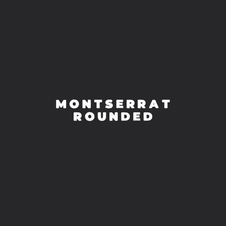
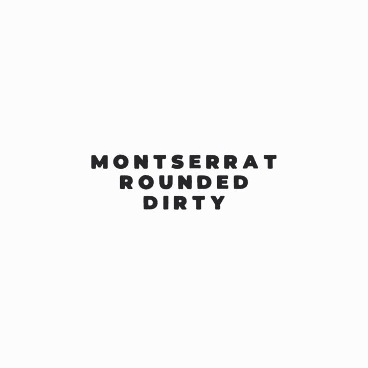
MONTSERRAT ROUNDED and MONTSERRAT DIRTY are our custom corporate fonts.


STATIONARY
Our business cards are printed by MOO on their 600 GSM LUXE paper and the edges were hand painted neon with our Stabilo BOSS text markers.


TOOLS
Inspired by the work of Tom Sachs, we decided to even define the tools and expendables we use in the studio and make them part of our CD-manual.


MERCH
We think every design studio has to have it’s own merch. So we created this black metal inspired “JUST BE AWESOME” shirt. You can buy it and some other cool stuff in our shop.


DIY
Because deep inside we are makers and so we try make our stuff by our self. Like the company signs, logo leather patches, studio decoration etc. And as every maker should do we try to document the process.


